Netflix
NETFLIX
Project: Vertical Video Feed | Role: Lead Content Designer
What is it?
A short-form vertical video feed that drives engagement and discovery of all of our product offerings.
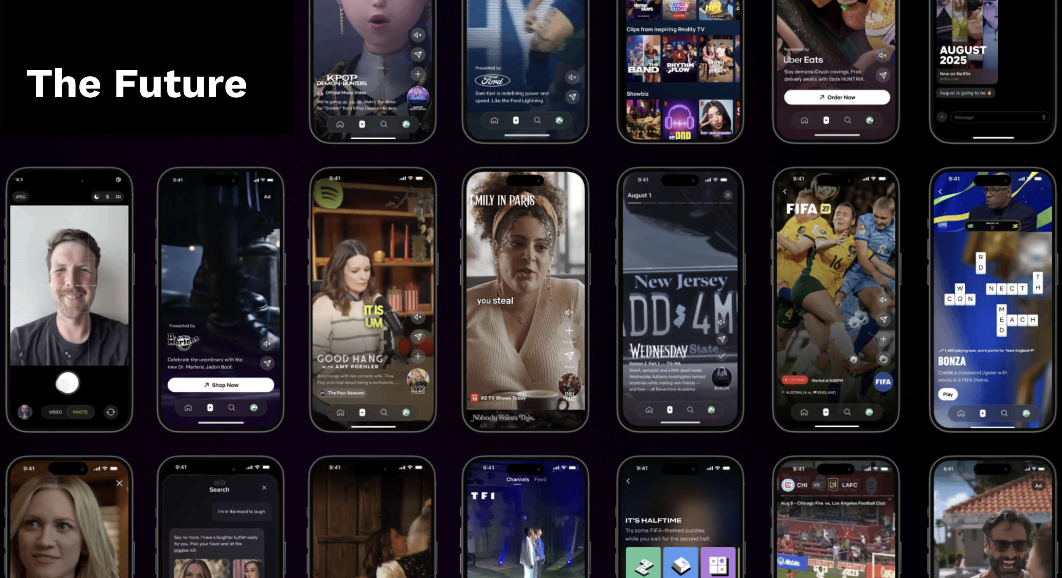
Problem: We were building the foundation of the feed and needed a flexible name that could be part of every stage of innovation.
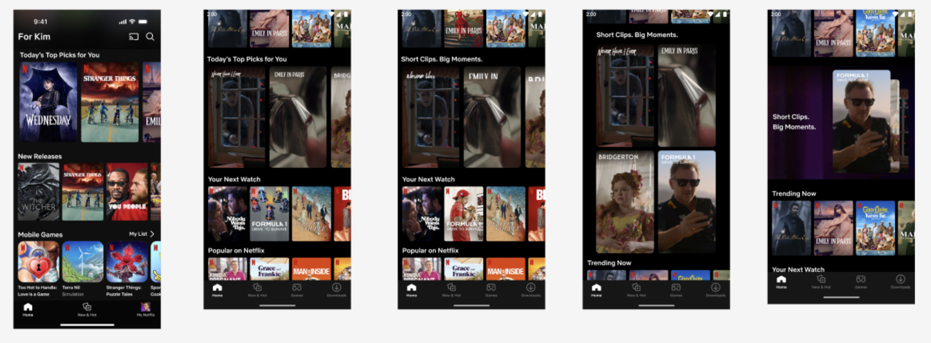
Process: Before we could get to our dream vision, we tested several different entry point models. For our first initial A/B test, we only tested 1 alternative row name, but otherwise leveraged an already existing row name. I had a hypothesis that ultimately that short form video across the app should be under one unified term — and could that term be “moments” — hence the name “Short clips. Big Moments.” Unfortunately for my hunch, members didn’t gravitate towards it and it performed poorly across all cells it was attached to.
For V2, the broader product team zero’ed in on a crisper more aligned hypothesis. For a long time we were only thinking about discovery and using the feed to help members discover what to watch next, but often times the very nature of a vertical video feed is just entertainment itself. So we decided to optimize for feed engagement and by setting it up with the right context and keeping members engaged in the feed.
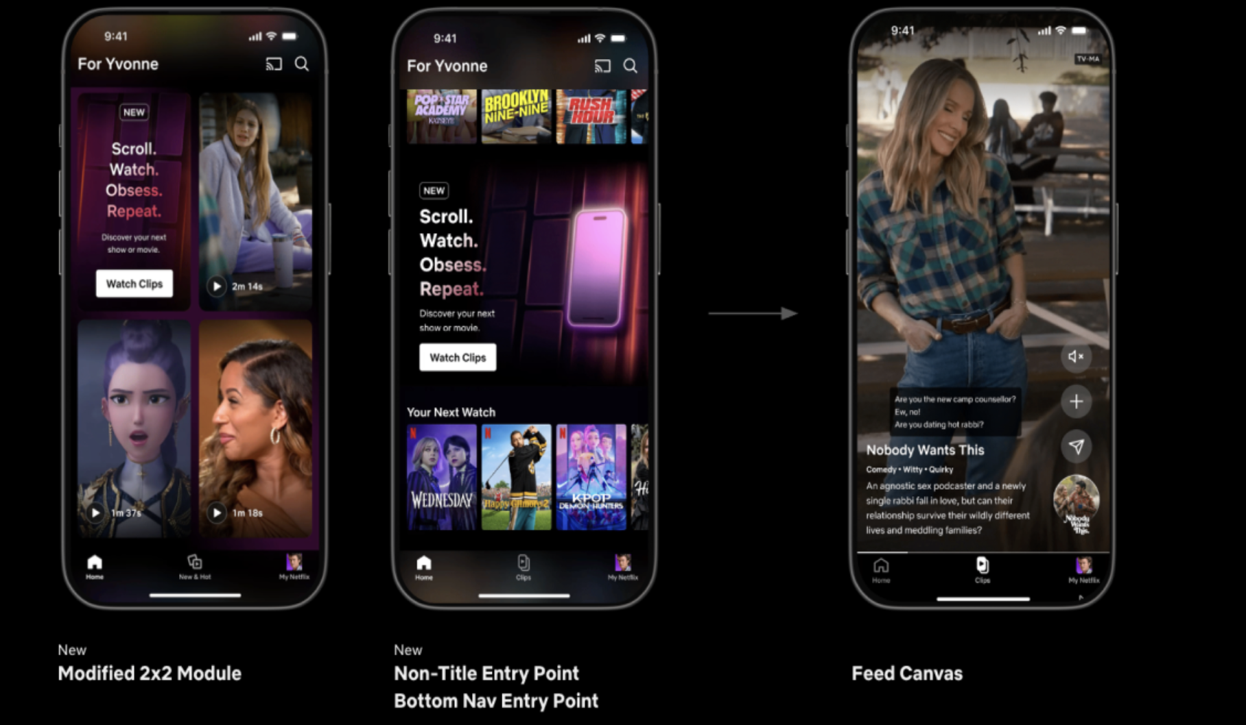
Above you can see 2 different design treatments we implemented and what the feed canvas ultimately looks like. When I first began exploring the copy, I envisioned having two different strings for both treatments, but due to the size and nature and complexity of this test, I needed to make sure it had the same copy across so we could get a clear read on which entry point works best.
For the entry point copy I made use to prioritize clarity over cleverness. We needed members to understand what to expect when they tap on the CTA. We needed language that simple, clear, and direct to grab members attention and reinforce the actions (and emotional reactions) we wanted the feed to induce.
The Scroll, Watch, Obsess, Repeat language was short, snappy, and contextual. For Scroll it highlights the scrolling motion members would be doing within the feed. Watch and Obsess emphasizes how they would be engaged within a particularly clip and finally Repeat instills how we want them to stay in the feed watching as many clips as possible repeating those actions.
A few of the test cells also included a bottom nav entry point. The name for this would be crucial and naming a feature of this level had many moving pieces. At the end of the day, my approach was that once again since we were optimizing for engagement we needed to remove any barrier to entry at this stage and make sure the name was clear, flexible, translatable, and differentiated. Members needed to know what the tab entailed in a quick glance and the name needed to flex through our innovation phases as we kept iterating on the types of short form videos that would be in the feed. If we called it something like “Scenes” but then ended up inserting videos from interviews it wouldn’t work. The label needed to work across many languges and it also couldnt be construed for some other tab in the product.
Ultimately “Clips” was the name that we went with. It’s the term that allows us to continue to innovate and when we do find the “right” branded name for the feature, it’s the easiest swap.